因为项目原因又玩上了Angular2(v4.0+),《玩转Angular2》系列用于探索一些灵活或者新的用法。
本文在前面的基础架构上,正式开启我们的动态表单生成之旅。
原控件相关调整
带输入的checkbox和radio
之前我们在配置radio-with-input以及checkbox-with-input的时候,是统一输入input的类型的,而实际使用中我们很可能一组选项中有不同的输入类型。
我们调整在每个选项中配置类型,目前暂时只支持三种:'text' | 'number' | 'email'。
我们的控件只需去掉原有的@Input() type,以及模板添加type就可以了:
1
| <input *ngIf="op.withInput" class="form-control form-inline-input" [type]="op.type || 'text'" />
|
动态表单调整
动态表单需要调整的有:
- 去掉提交按钮。
因很多时候控制在外面进行,当然使用事件来进行emit也是可以的。
但如果是多组表单联合的情况下,则不适合这样使用了,故我们取消按钮,采用下面的方式。
- 绑定值
前面我们使用[model]来传入初始值,但我们同样可以将变化传递回绑定对象。
因为该值绑定的是formGroup表单的value,故我们可以使用Object.assign(),从而不改变对象的引用而更新里面的值。
同时我们还增加了一个valid选项,方便我们获取校验状态,否则不好控制:
1
2
3
4
5
6
|
onValueChanged(data?: any) {
tthis.model = Object.assign(this.model, {...this.dynamicForm.value}, {valid: this.dynamicForm.valid});
}
|
- 调整
radio-with-input以及checkbox-with-input相关控件选项
更新为:
1
2
| <radio-with-input *ngIf="control.type === 'radio-with-input'" [options]="control.options" [formControlName]="control.key"></radio-with-input>
<checkbox-with-input *ngIf="control.type === 'checkbox-with-input'" [options]="control.options" [formControlName]="control.key"></checkbox-with-input>
|
选项配置功能
简单介绍
选项配置功能主要用于配置选项,最后生成的是我们前面某些选择表单(select、radio、checkbox等)的选项内容。
可见我们生成的结构如下:
1
2
3
4
5
6
| export interface IOptions {
id: string;
text: string;
withInput?: boolean;
type?: 'text' | 'number' | 'email';
}
|
每一条选项都有四个参数,其中的id和text则是必须要配的,而剩余的主要用于radio-with-input以及checkbox-with-input带输入可选的表单控件。
这里我们使用传入参数@Input() type的方式判断,若为’withInput’则添加后面两个参数的配置,无则不添加。
动态表单的配置
经过上面分析我们知道,每个选项我们最多需要四个配置:
id: text类型的inputtext: text类型的inputwithInput: 这里我们使用radio单选”是”或”否”type: 当withInput为”是”时,可下拉选择'text' | 'number' | 'email'其中一项
到这里,我们的配置文件大概出来了:
1
2
3
4
5
6
7
8
9
10
11
12
13
14
15
16
17
18
19
20
21
22
23
24
25
26
27
28
29
30
31
32
33
34
35
36
37
38
39
40
41
42
43
44
| export const optionsFormControl: ICustomControl[] = [
{
type: 'text',
label: 'id',
key: 'id',
validations: [{
type: 'required',
message: 'id必填'
}]
}, {
type: 'text',
label: 'text',
key: 'text',
validations: [{
type: 'required',
message: 'text必填'
}]
}, {
type: 'radio',
label: '是否带输入',
key: 'withInput',
options: [
{id: '0', text: '否'},
{id: '1', text: '是'},
]
}, {
type: 'radio',
label: '输入类型',
key: 'type',
options: [
{id: 'text', text: 'text'},
{id: 'number', text: 'number'},
{id: 'email', text: 'email'}
],
hiddenWhen: {
condition: '&&',
validations: [{
key: 'withType',
validate: '!=',
param: '1'
}]
}
}
];
|
选项配置的增删
前面讲了每个选项的配置,而我们通常需要配置特定个选项,故需要增删功能。
先看html模板:
1
2
3
4
5
6
7
8
9
10
11
12
13
14
15
16
17
18
19
20
21
22
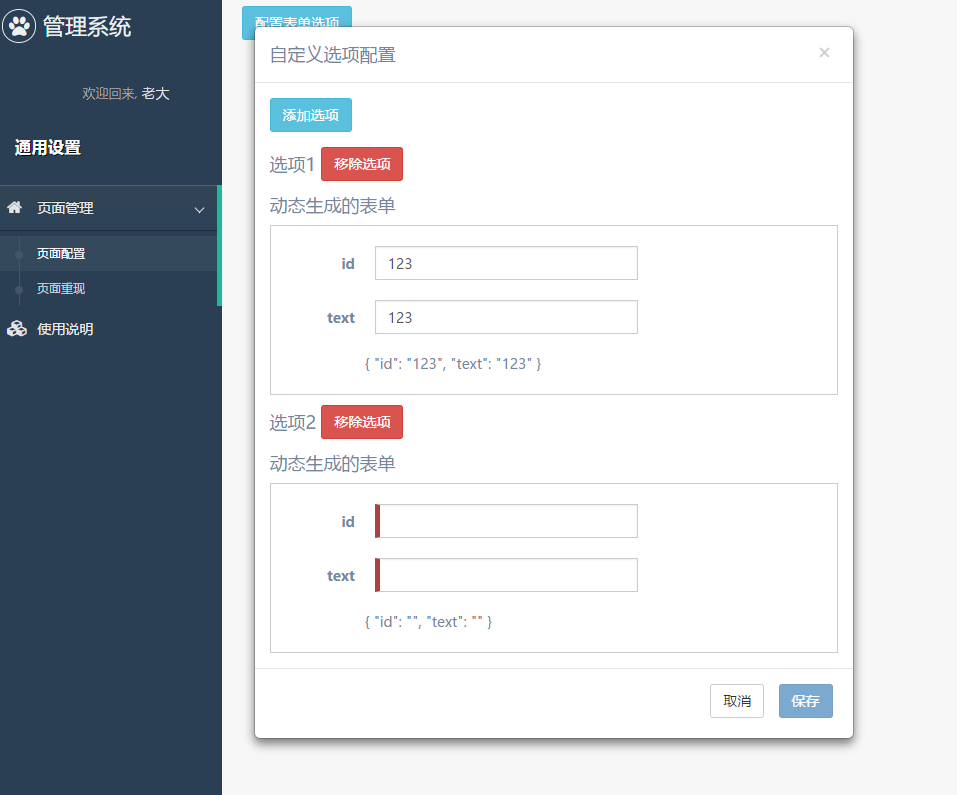
| <a class="btn btn-info" (click)="setOptions()" >配置表单选项</a>
<div class="modal" [hidden]="!isShown">
<div class="modal-dialog" role="document">
<div class="modal-content">
<div class="modal-header">
<button type="button" class="close" data-dismiss="modal" aria-label="Close" (click)="isShown = false;"><span aria-hidden="true">×</span></button>
<h4 class="modal-title">自定义选项配置</h4>
</div>
<div class="modal-body">
<a class="btn btn-info" (click)="addControl()" >添加选项</a>
<div *ngFor="let form of optionsForm; let i = index;">
<h2>选项{{i + 1}} <a class="btn btn-danger" (click)="optionsForm.splice(i, 1);" >移除选项</a></h2>
<dynamic-form [config]="optionControl" [(model)]="optionsForm[i]"></dynamic-form>
</div>
</div>
<div class="modal-footer">
<button type="button" class="btn btn-default" data-dismiss="modal" (click)="isShown = false;">取消</button>
<button type="button" class="btn btn-primary" [disabled]="!isValid()" (click)="saveOptions()">保存</button>
</div>
</div>
</div>
</div>
|
这是一个对话框配置,我们可以看到:
setOptions(): 进行表单选项的配置isShown: 控制对话框的展示addControl(): 添加一个选项optionsForm: 保存生成的选项组optionControl: 每个选项表单的配置,参看上面isValid(): 返回表单校验状态saveOptions(): 保存选项配置
简单地分析,我们可以大致获得我们的组件:
1
2
3
4
5
6
7
8
9
10
11
12
13
14
15
16
17
18
19
20
21
22
23
24
25
26
27
28
29
30
31
32
33
34
35
36
37
38
39
40
41
42
43
44
45
46
47
48
49
50
51
52
53
54
55
56
57
58
| const OptionInit = {
id: '',
text: ''
};
interface IOption extends IOptions {
valid?: boolean;
}
@Component({
selector: 'option-dialog',
templateUrl: './option-dialog.component.html',
})
export class OptionDialogComponent implements OnInit {
@Input() options: IOptions[] = [];
@Input() type: string = '';
optionsForm: IOption[] = [];
optionControl: ICustomControl[];
isShown: boolean = false;
ngOnInit() {
if (this.type === 'withInput') {
this.optionControl = optionsFormControl;
} else {
this.optionControl = optionsFormControl.slice(0, 2);
}
}
isValid(): boolean {
let valid = true;
this.optionsForm.forEach(op => {
if (!op.valid) {
valid = false;
}
});
return valid;
}
setOptions() {
this.isShown = true;
this.optionsForm = [].concat(this.options);
}
saveOptions() {
this.options = [].concat(this.optionsForm);
this.isShown = false;
}
addControl() {
this.optionsForm.push({...OptionInit});
}
}
|
增加列表展示
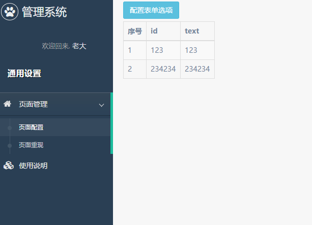
上面我们已经基本完成了选项配置的制作,当然最后我们还需要添加一个列表,来显示我们的配置成果:
1
2
3
4
5
6
7
8
9
10
11
12
13
14
15
16
17
18
19
20
21
22
23
24
| <div class="row" [hidden]="!(options && options.length)">
<div class="col-lg-12">
<table class="table table-bordered table-striped">
<thead>
<tr>
<th>序号</th>
<th>id</th>
<th>text</th>
<th *ngIf="type === 'withInput'">withInput</th>
<th *ngIf="type === 'withInput'">InputType</th>
</tr>
</thead>
<tbody>
<tr *ngFor="let op of options; let i = index">
<td>{{i+1}}</td>
<td>{{op.id}}</td>
<td>{{op.text}}</td>
<td *ngIf="type === 'withInput'">{{op.withInput === true ? 'true' : 'false'}}</td>
<td *ngIf="type === 'withInput'">{{op.withInput ? op.type : ''}}</td>
</tr>
</tbody>
</table>
</div>
</div>
|
到这里,我们的选项配置功能开发完毕。效果图如下:
结束语
使用自己搭建的基本架构,来进行二次开发的感觉其实挺棒的。
后面我们的这个选项配置再作为基础架构的一部分,来实现更多的功能,才是项目设计的有意思之处吧。
此处查看项目代码
此处查看页面效果
查看Github有更多内容噢:https://github.com/godbasin
更欢迎来被删的前端游乐场边撸猫边学前端噢
如果你想要关注日常生活中的我,欢迎关注“牧羊的猪”公众号噢