By
被删
更新日期:
因为项目原因又玩上了Angular2(v4.0+),《玩转Angular2》系列用于探索一些灵活或者新的用法。
本文介绍向表单添加简单的条件控制的过程。
表单条件
常用表单条件
很多时候,我们的表单需要添加一些条件,例如:
- 选择是否订阅邮件,是则需要填写邮件
- 针对不同的选择展示不同的表单控件
这里我们只考虑比较容易实现的:
- 校验
- 通过某个控件值的比较,来作为判断标准
- 传入其他控件的
key,通过常用比较>/>=/==等,来控制显示
- 条件(只能二选一),作为以上校验的叠加方式选择
- ‘&&’: 与,需同时满足多个条件
- ‘||’: 或,满足其中一个条件即可
通过以上我们可以定义基本配置接口结构:
1
2
3
4
5
6
7
8
9
10
11
12
13
14
15
16
17
18
19
20
21
|
export interface IHiddenValidate {
key: string;
validate: string;
param: string | number;
}
export interface IHiddenCondition {
condition: '||' | '&&';
validations: IHiddenValidate[];
}
export interface ICustomControl {
type: string;
label: string;
key: string;
validations?: IValidations[];
options?: IOptions[];
limit?: ILimit;
hiddenWhen?: IHiddenCondition;
}
|
条件判断
我们针对上面的数据结构,需要进行条件判断,返回布尔值来控制表单的显示或隐藏。
首先,我们添加一个用于计算条件的函数:
1
2
3
4
5
6
7
8
9
10
11
12
13
14
15
16
17
18
19
20
21
22
23
24
| export function validate(a, b, condition): boolean {
switch (condition) {
case '>':
return a > b;
case '>=':
return a >= b;
case '==':
return a == b;
case '===':
return a === b;
case '>':
return a > b;
case '>=':
return a >= b;
case '&&':
return a && b;
case '||':
return a || b;
case 'indexOf':
return a.indexOf(b) > -1;
default:
return true;
}
}
|
然后我们开始处理较复杂的条件和校验,先将多个校验计算出来,再使用条件合并:
1
2
3
4
5
6
7
8
9
10
11
12
13
14
| isHidden(control: ICustomControl) {
let hidden = false;
if (control.hiddenWhen && control.hiddenWhen.validations && control.hiddenWhen.validations.length) {
control.hiddenWhen.validations.forEach(valid => {
hidden = validate(
hidden,
validate(this.dynamicForm.value[valid.key], valid.param, valid.validate),
control.hiddenWhen.condition
);
});
}
return hidden;
}
|
通过这个方法我们就能控制是否显示对应表单控件了:
1
2
3
4
5
| <div *ngFor="let control of config" class="form-group">
<div *ngIf="!isHidden(control)">
</div>
</div>
|
实例配置
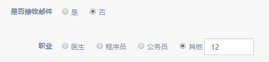
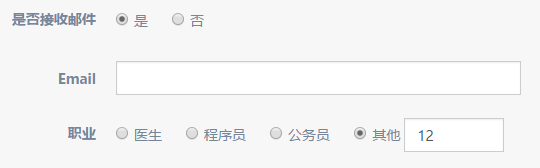
我们可以通过一个简单的邮件接收配置来检验:
1
2
3
4
5
6
7
8
9
10
11
12
13
14
15
16
17
18
19
20
21
22
23
24
25
26
27
| export const customForms: ICustomControl[] = [
{
type: 'radio',
label: '是否接收邮件',
key: 'emailReceived',
options: [
{id: '1', text: '是'},
{id: '0', text: '否'}
]
}, {
type: 'text',
label: 'Email',
key: 'email',
validations: [{
type: 'email',
message: 'Email格式不正确'
}],
hiddenWhen: {
condition: '||',
validations: [{
key: 'emailReceived',
validate: '==',
param: '0'
}]
}
}
];
|
效果如下:
带输入的选择
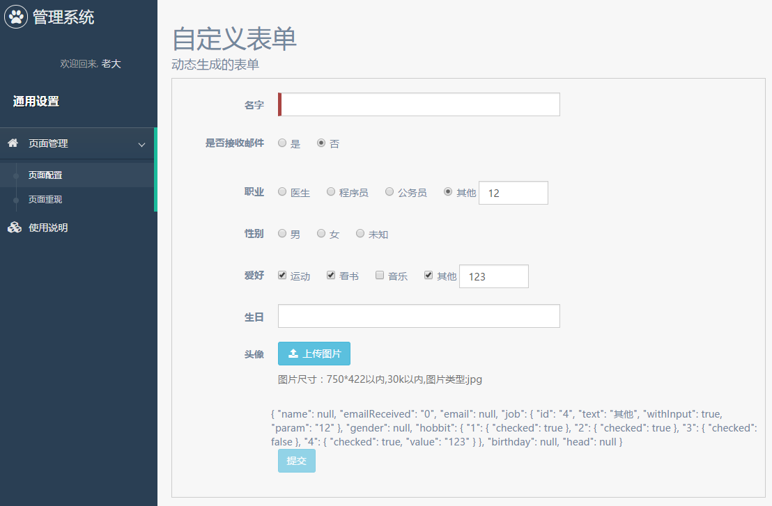
很多时候我们需要有这样的表单控件:
- checkbox勾选后可自定义填写
- radio选择自定义填写
这里我们简单做个组件封装吧。
带输入的checkbox
我们先来定义我们想要的效果:
1
2
3
4
5
6
| <span *ngFor="let op of options" class="form-check">
<input type="checkbox" [name]="value" [checked]="model[op.id] && model[op.id].checked"
(click)="setValue(op)" [disabled]="disabled" [value]="op.id"/>{{op.text}}
<input *ngIf="op.withInput" class="form-control form-inline-input"
[type]="type" [disabled]="!(model[op.id] && model[op.id].checked)" [(ngModel)]="model[op.id].value"/>
</span>
|
由于多了自定义填写,通过绑定选中数组的形式也不适用了,我们需要通过对象的方式来绑定返回值:
1
2
3
4
5
6
7
|
model = {
id: {
checked: boolen,
value: string | number
}
};
|
用的实现还是前面自定义表单的那一套:
1
2
3
4
5
6
7
8
9
10
11
12
13
14
15
16
17
18
19
20
21
22
23
24
25
26
27
28
29
30
31
32
33
34
35
36
37
38
39
| @Component({
selector: 'checkbox-with-input',
template: `...同上`,
providers: [customInputAccessor(CheckboxWithTextComponent)]
})
export class CheckboxWithTextComponent implements OnInit {
@Input() options: IOptions[] = [];
@Input() disabled: boolean = false;
@Input() type: string = 'text';
private model: any = {};
private onChange: (_: any) => void;
private onTouched: () => void;
ngOnInit() {
this.options.forEach(op => {
this.model[op.id] = {
checked: false,
};
if (op.withInput) {
this.model[op.id].value = '';
}
});
}
setValue(op: any) {
const isChecked = !this.model[op.id].checked;
this.model[op.id].checked = isChecked;
this.onChange(this.model);
}
}
|
然后我们在动态表单里面添加进去:
1
2
| <checkbox-with-input *ngIf="control.type === 'checkbox-with-text'" type="text" [options]="control.options" [formControlName]="control.key"></checkbox-with-input>
<checkbox-with-input *ngIf="control.type === 'checkbox-with-number'" type="number" [options]="control.options" [formControlName]="control.key"></checkbox-with-input>
|
而带输入的radio大家就自己解决吧,本骚年的项目代码里面有,基本与checkbox的很相像。
结合上面,最终我们的效果图如下:
结束语
这里我们只针对简单的条件进行表单校验,并且这里只能匹配一些简单绑定的值,像多选等因为绑定的值为对象,暂无法进行条件判断。
一些复杂的控制功能或许需要我们通过其他方式进行吧,毕竟很多时候更广的通用性也会增加设计的复杂度、消耗使用的简便性。
此处查看项目代码
此处查看页面效果
查看Github有更多内容噢:https://github.com/godbasin
更欢迎来被删的前端游乐场边撸猫边学前端噢
如果你想要关注日常生活中的我,欢迎关注“牧羊的猪”公众号噢