
玩转Angular2(12)--配置以及生成表单
更新日期:
因为项目原因又玩上了Angular2(v4.0+),《玩转Angular2》系列用于探索一些灵活或者新的用法。
本文讲述我们使用表单生成的功能,来进行表单的自定义配置和生成。
自定义表单作为表单控件
option-dialog
上一节《玩转Angular2(11)–使用动态表单制作选项配置对话框》我们讲了使用动态表单制作选项配置对话框,这里面我们需要将这样的组件重新作为表单的一部分,在我们的自定义表单中使用。
我们需要调整来使得以下方式可用:
1 | <option-dialog [type]="optionsType(control.type)" [formControlName]="control.key"></option-dialog> |
这时候我们又需要前面的自定义input神奇了:
1 | import {customInputAccessor} from '../../class/custom-input.class'; |
hidden-when-dialog
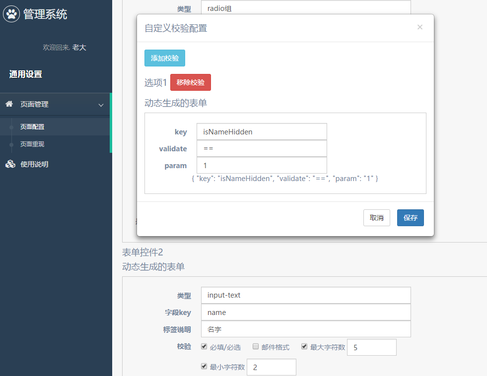
我们的配置选项中,有一个是hiddenWhen参数,该参数也是通过配置多项条件的方式,这里我们也添加一个hidden-when-dialog来配置。
由于篇幅关系,这里只看看配置文件:
1 | export const validationsFormControl: ICustomControl[] = [ |
至于组件的html和js大家可以翻阅项目代码(在文章最后有链接)。
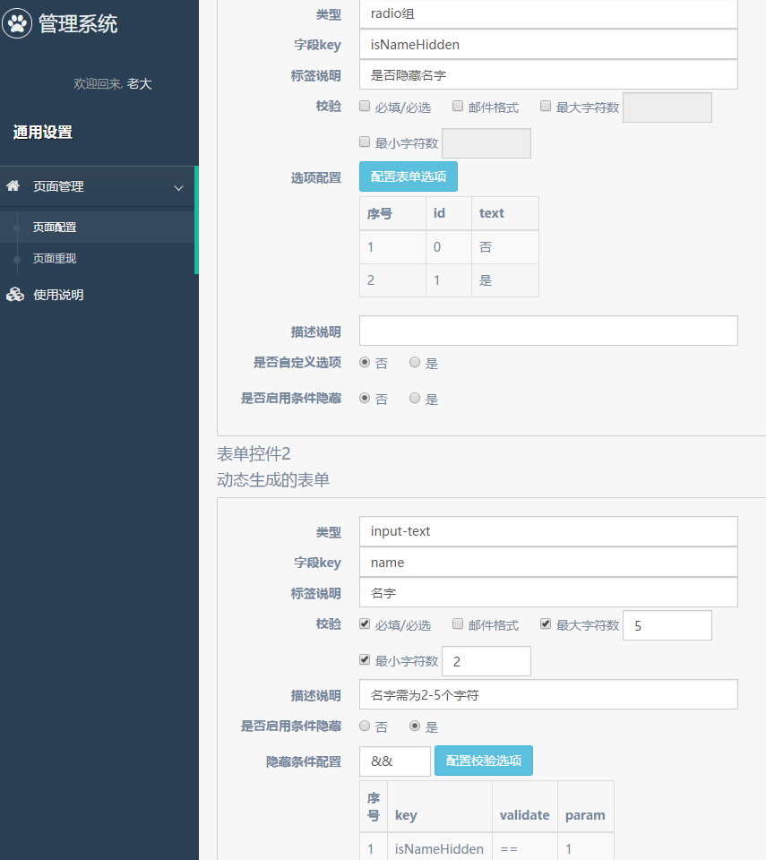
配置表单
表单的选项和结构
目前为止,我们的表单控件格式大致是下面这些:
1 | export interface ICustomControl { |
我们需要添加一些选项或者是输入,来让使用的人生成以上的格式,然后生成想要的表单。
这里面需要详细配置的有:
validations- 校验方式,如
required、maxLength等 - 这里可以使用
checkbox-with-input的方式来配置
- 校验方式,如
1 | export interface IValidations { |
options- 选项配置,当选择的类型
type需要配置选项时出现 type == 'select' || type == 'radio' || type == 'checkbox'等等- 前面的
option-dialog已封装该功能,并提供自定义表单使用,但目前只支持id和text的配置
- 选项配置,当选择的类型
1 | export interface IOptions { |
limit- 图片校验,只当选择图片上传时使用
- 使用
checkbox-with-input的方式来配置
1 | export interface ILimit { |
hiddenWhen- 条件符合时隐藏,可配置多个条件,并设置多个条件的关系(
||或&&) hidden-when-dialog
- 条件符合时隐藏,可配置多个条件,并设置多个条件的关系(
1 | export interface IHiddenCondition { |
配置表单的配置
接下来我们来配置生成这样一个用来生成配置的表单吧:
1 | export const normalFormControl: ICustomControl[] = [ |
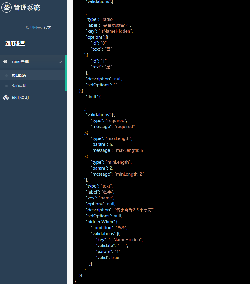
大家会发现,上面的配置并不完全可以得到我们最后想要的配置,如limit和options的格式,故我们最后还需要输出时调整:
1 | formJson() { |
而我们的html模版长这样:
1 | <div style="margin-top: 30px;"> |
配置生成表单
生成json展示
上面大家也看到了json-to-html,其实主要拿以前实现的其中一种方法来生成带样式的json,具体实现大家可以参考《将json输出为html(一):字符串正则匹配》和《将json输出为html(二):js数据类型判断实现》。
这里我们将它稍微封装一下:
1 | @Component({ |
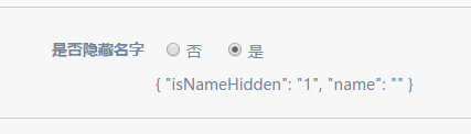
读取配置
我们将上面生成的json复制一下,粘贴到一个地方,然后就可以生成想要的表单了。
这里配置读取很简单:
1 | <div style="margin-top: 30px;"> |
使用*ngIf主要是方便控制[config]的输入更改的时候重新生成,因为自定义表单通常不会动态改变,故我们不将该功能拓展进去。
生成配置也很简单:
1 | customControl: ICustomControl[]; |
这样,我们就能实现表单的创建和生成啦。效果图如下:

结束语
项目中表单配置部分大致的实现也是差不多告一段落啦,后面可能更多的是补充和优化而已。
而其实项目还可以多种拓展呢,像这样的添加配置像(validations和hiddenWhen)也可以通过抽象做成更加通用的功能。
此处查看项目代码
此处查看页面效果
完整项目也可查看angular-custom-app项目。

码生艰难,写文不易,给我家猪囤点猫粮了喵~
查看Github有更多内容噢:https://github.com/godbasin
更欢迎来被删的前端游乐场边撸猫边学前端噢
如果你想要关注日常生活中的我,欢迎关注“牧羊的猪”公众号噢